March 14, 2024
Designing a website for a childcare centre requires careful consideration, especially when it comes to choosing colours. The colours you select can evoke certain emotions, convey your brand identity, and create a welcoming environment for both children and parents.
In this guide, we’ll explore how to decide what colours to use for your child care centre website to ensure it reflects your values and appeals to your target audience.
Understanding Colour Psychology:
Before diving into colour selection, it’s essential to understand the basics of colour psychology. Different colours have different psychological effects on people:
Blue:
Evokes feelings of calmness, trust, and security. Blue is often associated with the sky and the ocean, creating a sense of serenity and tranquillity. It’s commonly used in professional settings due to its connotations of reliability and dependability. In the context of a child care centre website, blue can reassure parents of the safety and security of their children while also promoting a peaceful and nurturing environment.
Yellow:
Symbolises energy, happiness, and optimism. Yellow is the colour of sunshine, evoking feelings of warmth and positivity. It can grab attention and stimulate mental activity, making it an excellent choice for highlighting important information or calls to action on your website. In a child care centre context, yellow can convey a sense of joy and playfulness, creating an inviting and cheerful atmosphere for children and parents alike.
Green:
Represents growth, nature, and health. Green is often associated with the natural world, symbolizing renewal, harmony, and balance. It’s a calming colour that can promote feelings of relaxation and well-being. Incorporating green into your child care centre website can emphasise your commitment to environmental sustainability and outdoor activities, fostering a connection to nature and promoting healthy living habits.
Red:
Signifies passion, excitement, and urgency. Red is a bold and attention-grabbing colour that can evoke strong emotions. It’s often associated with energy and action, making it effective for creating a sense of urgency or importance. In the context of a child care centre website, red can be used sparingly to highlight key elements, such as enrollment deadlines or upcoming events, while also adding a touch of excitement and vitality to the overall design.
Orange:
Combines the energy of red and the happiness of yellow. Orange is a vibrant and dynamic colour that commands attention and radiates warmth. It’s often used to convey enthusiasm, creativity, and friendliness. Incorporating orange accents into your child care centre website can add a playful and energetic vibe, making it feel welcoming and engaging for both children and parents.
Purple:
Symbolises creativity, luxury, and imagination. Purple is a rich and luxurious colour that is often associated with royalty and spirituality. It can evoke feelings of mystery, magic, and wonder, making it ideal for stimulating creativity and imagination. Incorporating purple into your child care centre website can convey a sense of sophistication and elegance while also encouraging children to explore their imaginations and express themselves freely.
Pink:
Evokes feelings of sweetness, innocence, and femininity. Pink is a gentle and soothing colour that is commonly associated with love, compassion, and nurturing. It’s often used in child-related contexts to create a sense of warmth and affection. Incorporating pink into your child care centre website can create a soft and nurturing atmosphere, reassuring parents that their children will be cared for with love and kindness.
White:
Represents purity, simplicity, and cleanliness. White is a clean and minimalist colour that can create a sense of space and openness. It’s often used as a background colour to enhance readability and highlight other elements on the page. In the context of a child care centre website, white can convey a sense of cleanliness and organisation, instilling confidence in parents that their children will be in a safe and hygienic environment.
Grey:
Conveys neutrality, sophistication, and professionalism. Gray is a versatile and understated colour that can provide a sense of stability and balance. It’s often used as a neutral backdrop to complement other colours and elements in the design. In the context of a child care centre website, grey can add a touch of sophistication and professionalism while also allowing brighter colours to stand out and capture attention.
Brown:
Symbolises stability, reliability, and warmth. Brown is a grounded and earthy colour that is often associated with the natural world. It can evoke feelings of warmth, security, and comfort, making it an excellent choice for creating a cozy and inviting atmosphere. Incorporating brown into your child care centre website can convey a sense of stability and reliability, reassuring parents that their children will be well-cared for in a nurturing and supportive environment.
Considering Your Brand Identity:
Your child care centre likely has its own unique brand identity, which should be reflected in your website design. Consider your logo, branding materials, and overall aesthetic when choosing colours. If your brand already has established colours, incorporate them into your website design to maintain consistency and reinforce brand recognition.
Appealing to Your Target Audience:
When selecting colours for your child care centre website, it’s crucial to consider your target audience. While bright and playful colours may appeal to children, you also need to consider the preferences of parents and caregivers. Aim for a balance that reflects the fun and nurturing environment of your centre while also instilling confidence and trust in parents.
Creating a Harmonious Colour Palette:
Once you have a good understanding of colour psychology, your brand identity, and your target audience, it’s time to create a harmonious colour palette for your website. Consider the following tips:
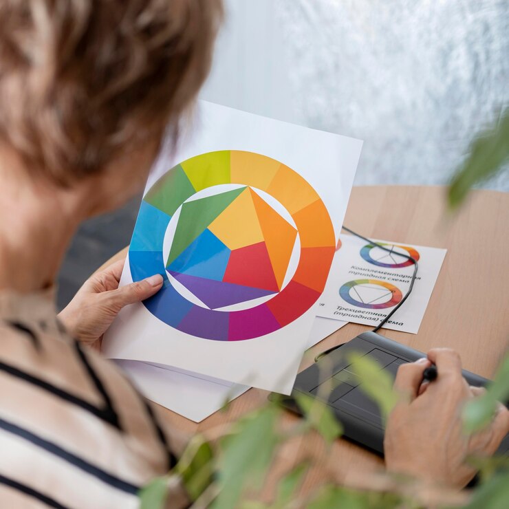
Use a combination of complementary colours:
Complementary colours are pairs of colours that are opposite each other on the colour wheel. When used together, they create a strong contrast and vibrant visual interest. For example, pairing blue with orange or green with red can create a dynamic and eye-catching colour scheme.
By incorporating complementary colours into your childcare centre website design, you can create a visually appealing layout that captures attention and engages visitors.
Limit your colour palette:
While it can be tempting to use a wide range of colours to make your website stand out, too many colours can overwhelm visitors and detract from the overall design. To maintain a cohesive and harmonious look, it’s best to stick to a limited colour palette of 2-4 colours.
Choose colours that complement each other well and reflect the tone and personality of your childcare centre. By keeping your colour palette streamlined, you can create a more visually pleasing and easy-to-navigate website.
Pay attention to accessibility:
Accessibility is an important consideration when choosing colours for your website, especially for text and background contrast. Ensure that your colour choices meet accessibility standards, such as those outlined in the Web Content Accessibility Guidelines (WCAG).
This includes ensuring sufficient contrast between text and background colours to make content easy to read for all users, including those with visual impairments. By prioritising accessibility in your colour choices, you can make your childcare centre website more inclusive and user-friendly for everyone.
Test different combinations:
Experimenting with different colour combinations is essential to finding the right balance for your website. Use online tools or consult with a professional designer to test various colour schemes and see what works best for your brand and audience. Consider factors such as mood, readability, and brand identity when evaluating different combinations. By testing and refining your colour choices, you can create a visually appealing and effective website that resonates with your target audience.
Consider cultural associations:
Colours can have different cultural associations and meanings, so it’s important to be mindful of these when designing your childcare centre website, especially if your centre serves a diverse community. Certain colours may have specific cultural significance or connotations that could impact how different groups of people perceive them.
Take the time to research and understand the cultural associations of colours relevant to your audience, and choose colours that are inclusive and respectful of diverse backgrounds and perspectives. By considering cultural associations in your colour choices, you can ensure that your child care centre website is welcoming and relatable to all visitors.
Conclusion:
Choosing the right colours for your child care centre website is an important aspect of creating a welcoming and engaging online presence.
By understanding colour psychology, considering your brand identity and target audience, and creating a harmonious colour palette, you can design a website that reflects the values of your centre and appeals to both children and parents.
Remember to periodically review and update your colour choices to ensure they remain relevant and effective over time.
